Iconsets for Sanquin
| Client | Sanquin Research |
|---|---|
| Disclipines | Visual Design Icons |
| Time period | Start of 2017 |
| Client | Sanquin Research |
|---|---|
| Disclipines | Visual Design Icons |
| Time period | Start of 2017 |
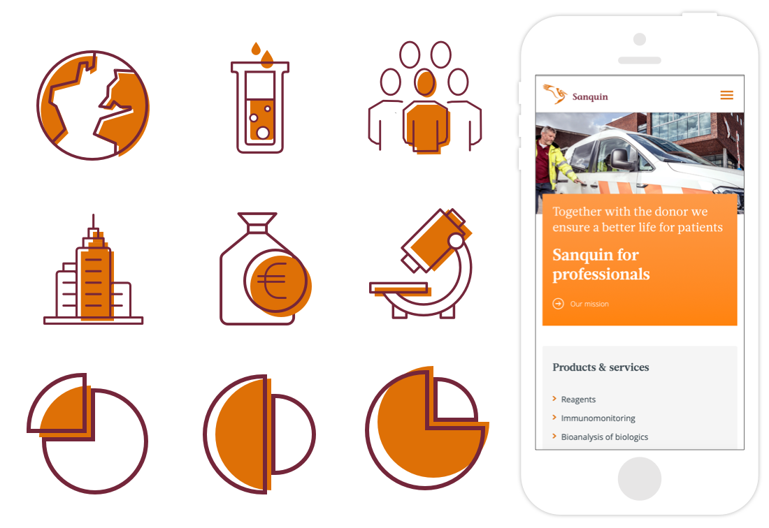
Two iconssets designed for Sanquin.org, the corporate website of the research branch of the Dutch blood bank Sanquin. One based on an existing set, the other completely new!
The first iconset is based on an existing iconset. White space between the different elements have been added to give them a more modern and friendly appearance. These icons are currently being used on the website.

The second set of icons is based to the Sanquin brand itself, which gives them a more distinguished look. These icons are currently only used internally, for example in presentations.
